Preparing data for Power BI
The WebMap for Power BI visual provides a backdrop map for data held within the Power BI environment. Once the data is loaded into Power BI, it can be used to create a map as part of the report.
The visual needs coordinate information included as separate fields within the data source in either a local coordinate reference system or latitude and longitude.
Additional fields in the data can then be used for display, hyperlinks or images.
- The visual displays point data only.
- Think about the context and display of your data. Visualisation of data works best with focused datasets and fewer (rather than more) points on the map.
- There is also a practical limit to the number of points which can be displayed on a report before performance is affected. This will vary depending on the data source, the network infrastructure and the performance of GeognoSIS.
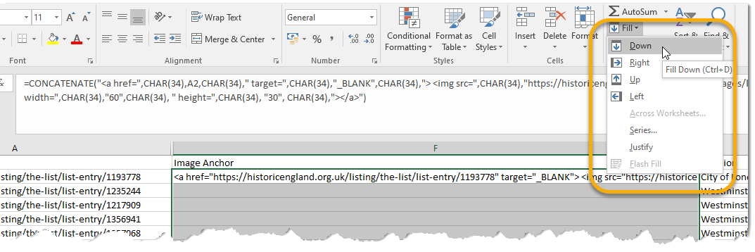
- Formatting Data in Excel: To create the required Anchor element in Excel, use the following expression.
Copy
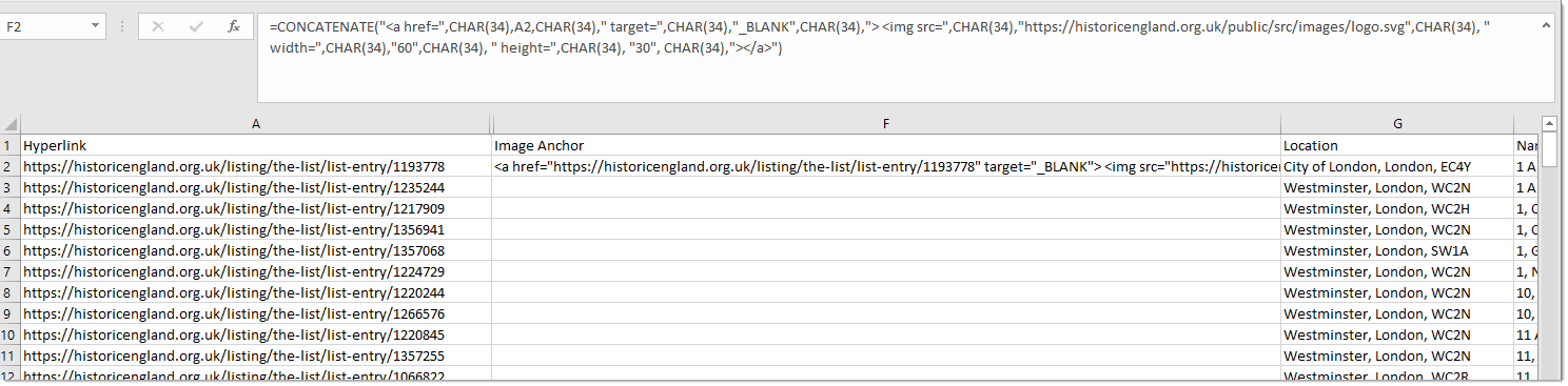
=CONCATENATE("<a href=",CHAR(34),A2,CHAR(34),
" target=",CHAR(34),"_BLANK",CHAR(34),">
<img src=",CHAR(34),"https://historicengland.org.uk/public/src/images/logo.svg",
CHAR(34)," width=",CHAR(34),"60",CHAR(34)," height=",CHAR(34), "30", CHAR(34),">
</a>")
This assumes your data includes a column A which holds the hyperlink. CHAR(34) is required to add double quotes to the anchor.
The output of this expression will be:
<a href="https://historicengland.org.uk/listing/the-list/list-entry/1193778" target="_BLANK">
<img src="https://historicengland.org.uk/public/src/images/logo.svg" width="60" height="30">
</a>
Use the Fill > Down option to populate the full set of records.