Cartogram
Cartograms are thematic maps of a set of features (countries, provinces, etc.). Their actual geographic size is altered to be directly proportional to a selected ratio-level variable (e.g. travel time, population etc)
Types of Cartograms
1. Contiguous – Diffusion
Use this method to create Gastner/Newnam diffusion-based cartogram Polygons from Polygons or MultiPolygons. The Contiguous-Diffusion method changes the size of each geographic region such as LSOAs or Wards so that they appear in proportion to the data attribute. The geographical location is maintained.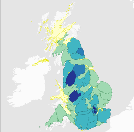
2. Non-contiguous - Dorling
Use this method to create 'Dorling' circular cartogram Polygons from input Polygons or MultiPolygons. The Non Contiguous method is graphical in nature. These types of cartograms make it easy to recognize patterns. However, it doesn’t maintain the centroid and shape. This means readers may have difficulty understanding features on the map.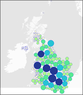
3. Equal Area
Use this method to create gridded or tessellating cartograms. The Equal Area method ignores graphical shape but maintains a more uniform topology.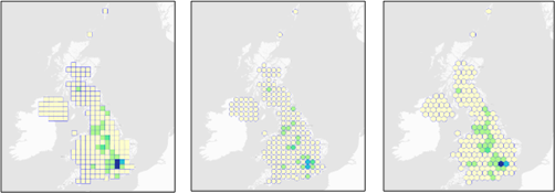
Example
In this example, we construct cartograms to display the Count of Public Electric Vehicle Points 2022. To create a Cartogram, you MUST have numeric data in your polygon dataset.
Here we will use:
-
A point dataset of UK Public Electric Vehicle Charging locations
-
A polygon dataset of UK Admin 2 areas.
Remember to include a Spatial Expression to handle the count. ![]() Related Topics
Related Topics
Select Analysis > Geometry > Cartogram.
This opens the Cartogram options: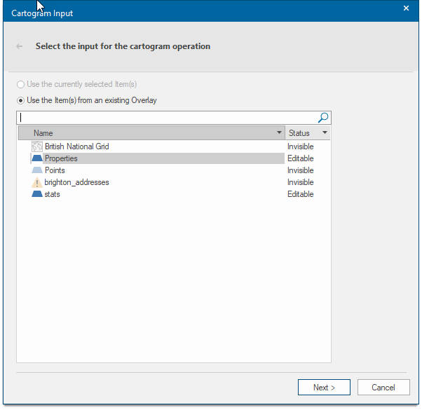
Select an overlay and click Next.
Select the type of Cartogram you need. In this instance we have chosen Contiguous Diffusion.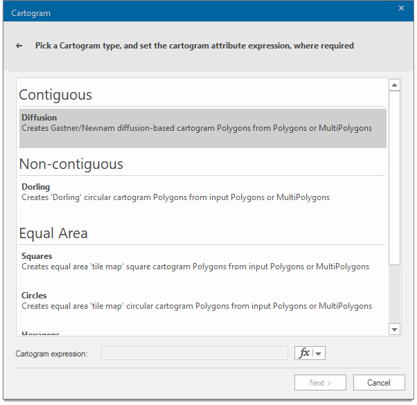
Select the Cartogram Expression area at the bottom of the dialog and click the fx button and choose Edit an Expression.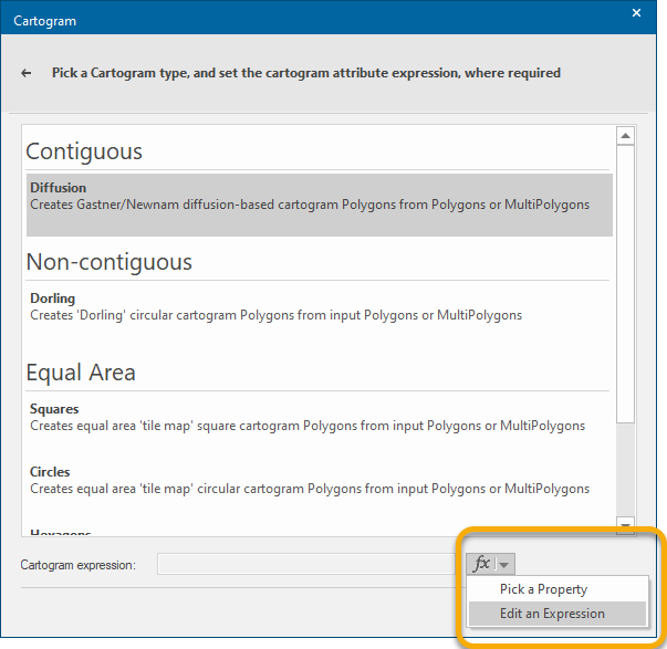
From the Expression Categories panel select No of EV Charging Points. In the Expression Values panel, double-click <Value>. The expression now appears at the top.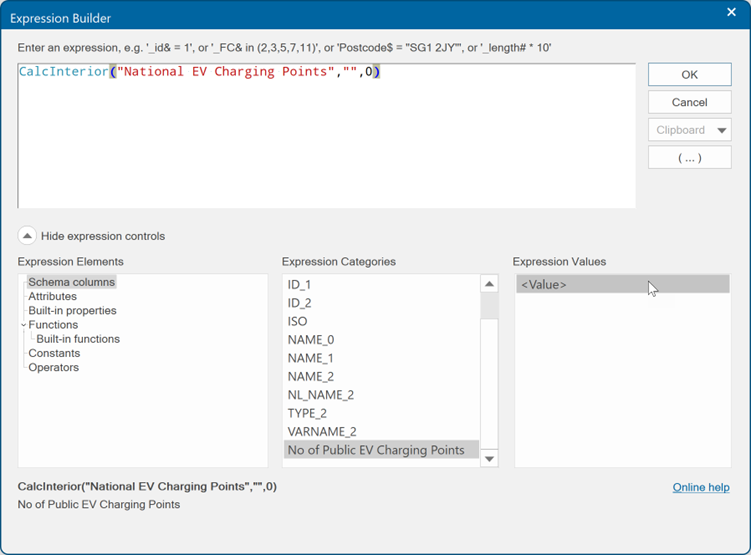
Click OK.
You will now see the Expression displayed at the bottom of the dialog. Click Next.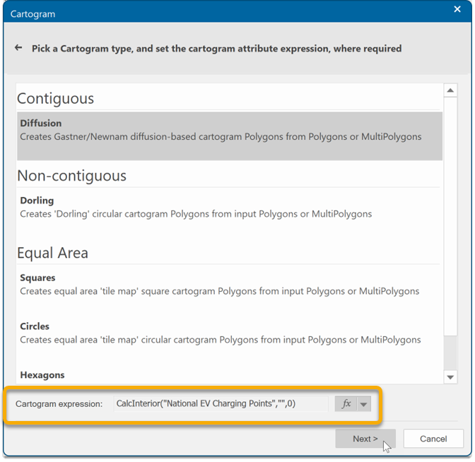
The next step is to create an Overlay for the Cartogram. In this instance it will be an Internal Dataset.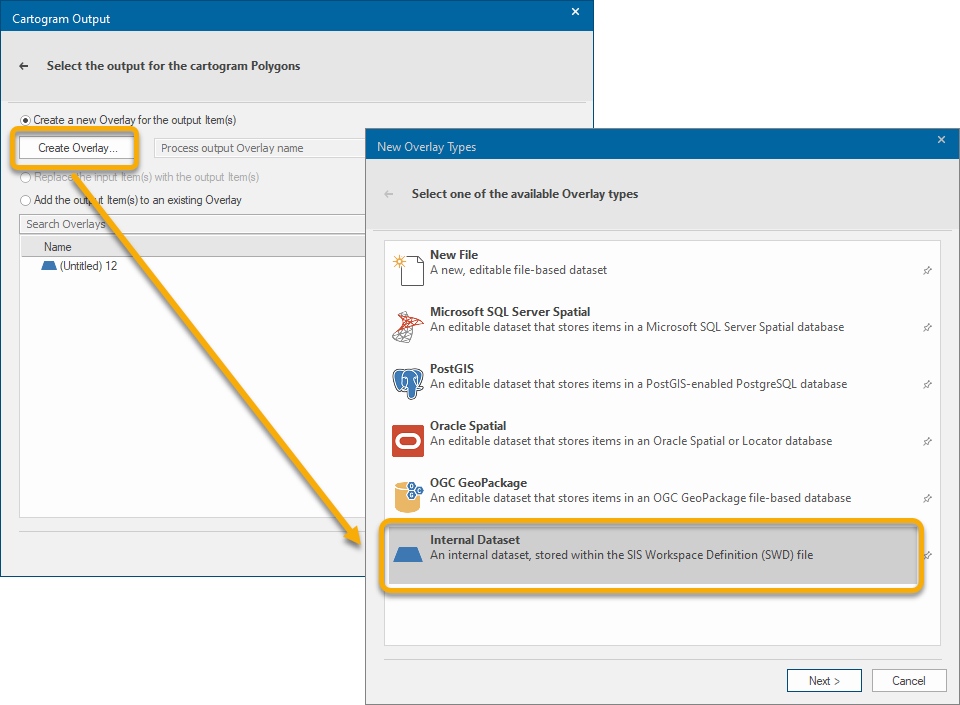
Name the Internal Overlay Contiguous – Diffusion and click Finish.
The new Overlay now displays the diffused areas.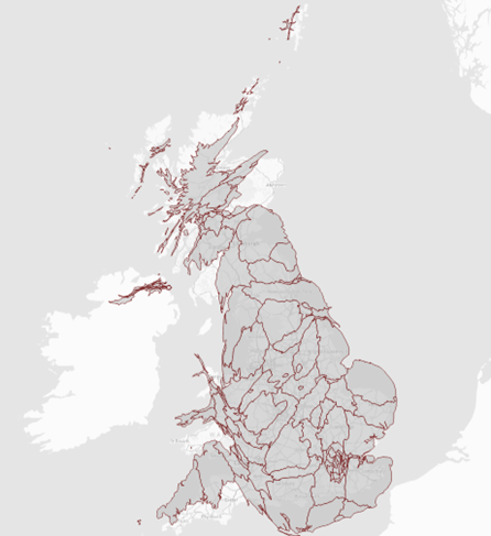
A new column has also been created in the Overlay Schema to hold the values for each area.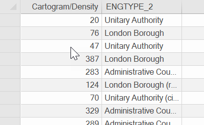
Add a Theme to the Cartogram
To make sense of the Cartogram areas, you can create a Theme to display the Range of data values. ![]() Related Topics
Related Topics
-
Select Home > Add Theme.
-
Select the new Overlay and click Next.
-
From the Styles list, select Ranges and click Next.
-
Select the new column called Cartogram/Density.
-
Click Next and choose Yes when you see the prompt to search for existing values.
-
In this example the data has been changed to show a Number of ranges as 5 and Equal Range.
-
Set the colour spread.
-
Click Finish.