Mobile Interface
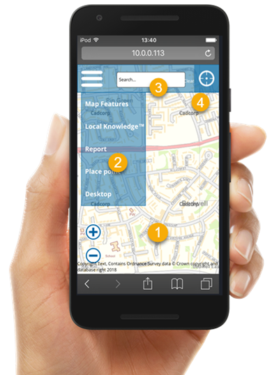
SIS WebMap can be used seamlessly on any mobile device (phone or tablet). With a clean, friendly interface and powerful querying, this is true GIS functionality at your fingertips.
WebMap 9.1 features a responsive interface design which allows the same website to be used on a range of devices. As the screen gets smaller, the interface changes to reflect the required functionality for mobile devices and allow better access to maps and dialogs on a smaller screen.
Note: The mobile interface does not contain a separate Base Map Picker as it does in the desktop version, this is to allow you to utilize the full screen for viewing the map. Instead base layers can be found along with data layers in the Map Features dialog.
- Dialogs which appear from the side of the screen and require views of the Map now appear from the bottom of the screen.
- Zoom in and out buttons on the Map are removed. Use the phone's zoom functions to view the map.
- My Data functionality is removed; use the Quick Access Drawer for data management.
- Drawing, Publish and Coordinate Readout options are not available.
When using a mobile device, these are the map options available from the drop-down menu is:
- Local Knowledge
- Measure
- Zoom to Coordinates
- Bookmarks
- Editing
- Capture
- Query
The following options are accessible from the top bar:
- Quick Search
- Share
- Profile

 Drag finger across the screen to pan the map
 Pinch and stretch to zoom in and out of the map.
 Double tap any feature on the map for a precise zoom.
 Press and hold any feature to view more details.