 Search Tips
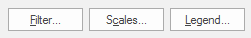
Filter, Scales and Legend buttons
This page describes the functions of the Filter, Scales and Legend buttons available for certain themes.
The following Themes have these three buttons:
1. Filter
The Filter option controls which items are displayed in the map window. Filtering can be carried out on the basis of item classes, features, properties or using a combination of filters.
The example used here is a Simple Styles theme but the functions of these buttons are identical for all themes. The Legend display will vary between different themes.
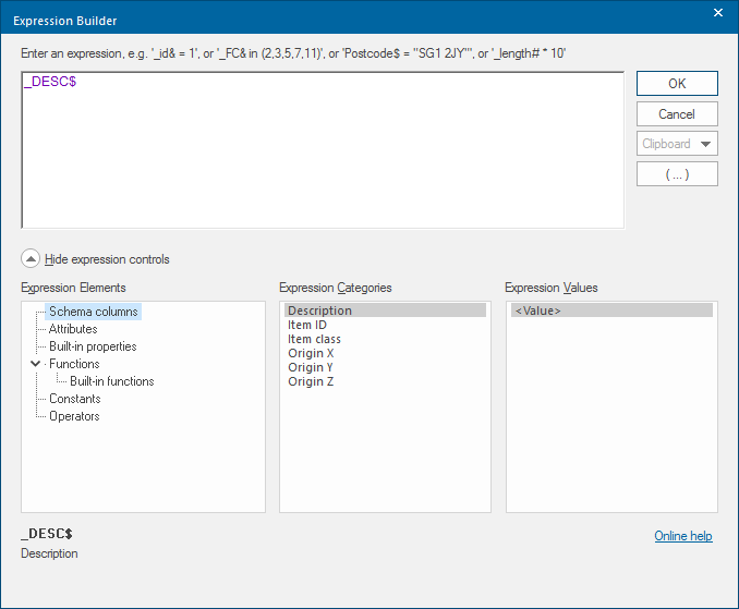
Click Filter to display the Expression Builder dialog:
Remember items excluded by the filter are not displayed (and so cannot be edited either). If you create items which are excluded by the filter, these will be drawn but not shown.
Filters are named objects, stored in Named Object Libraries (NOLs) which use item properties to include ("pass") some items, but exclude ("fail") others.
Filter objects work by examining the properties of an Item. So one filter could look at the colour of an Item and only "pass" those that are red. (In the same way as a camera can use coloured glass to filter the images of the photographs it takes.)
Filter objects can be applied to overlays to control the visibility of the items in that overlay. Only items that pass are drawn.
Items that fail the filter are not drawn, so you can make them temporarily invisible without having to delete them. In addition, many Cadcorp SIS methods, e.g. Scan, accept a Filter as an argument.
2. Scales
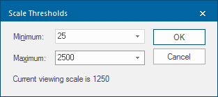
The Scales button allows you to choose the minimum and maximum scale thresholds between which the theme is displayed.
3. Legend
A legend can be placed on a print template which contains overlays that are themed.
TIP: See About Print Templates.
All print template ‘furniture’ (scale bars, legends, north points, and so on) has a default Level value of 1.
The map frame item in the print template has a default Level of 0.
This means any items you add to the print template should automatically appear on top of it when you print. When you are styling a legend to add to a print template, if you leave this as (implicit), it means that the Legend box should always be drawn on top of the map graphics.
Overlays and data formats that use the SIS feature tables automatically display the attributes as a theme legend on the overlay. The theme legend based on the overlay’s feature table can also added to a print template, see Print Template.
Styling a legend
Legends are created automatically and may be edited as required.
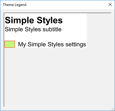
Click the Legend button to display the Legend dialog that allows you to create or edit a legend:
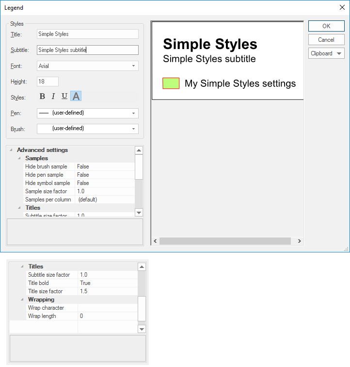
The Legend dialog is resizeable to allow all text and samples to be previewed.
| Option | Description | |
|
Title |
This is the title text of the legend. Title text is drawn at twice the height specified in the Height box and is always bold. |
|
|
Subtitle |
This is optional subtitle text for the legend. Subtitle text is drawn at the height specified in the Height box. |
|
|
Font |
The font to be used for all of the legend text. |
|
|
Height |
The point height used for all of the legend text, except for the Title, which is twice the height. |
|
|
Styles - Bold/Italic/underline |
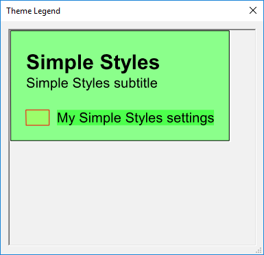
Sets all the legend text to bold/italic/underlined. Bold cannot be turned off for the Title. The A (Opaque) button sets the whole legend to opaque by filling in its background with the brush colour set in the Brush drop-down, for example: A (Opaque) off:
A (Opaque) on:
|
|
|
Pen |
Sets the text colour for all of the legend text. |
|
|
Brush |
Sets the background colour for the legend backdrop, which is only drawn if the opaque style is used. To view or edit the brush, drop-down the combo-box list, and press the right arrow at the bottom. |
|
|
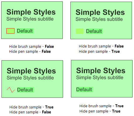
Advanced settings- Samples |
Hide brush sample - Should the brush sample in the legend be hidden? True/False. Hide pen sample - Should the brush sample in the legend be hidden? True/False. The following diagram shows the effect of the Hide brush sample and Hide pen sample settings:
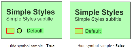
Hide symbol sample - Should the symbol sample in the legend be hidden? True/False. The following diagram shows the effect of the Hide symbol sample settings, if a symbol has been used:
Sample size factor - This is the scale factor to apply to the sample, relative to the text height which does not change. Samples per column - The number of samples, i.e. Theme components, per legend column. This property can have a value up to 200. |
|
|
Advanced Settings- Titles |
Subtitle size factor - This is the scale factor to apply to the subtitle text, relative to the text height. The range is 1.0 to 3.0. Title bold - Should the title text be bold? True/False. Title size factor - This is the scale factor to apply to the title text, relative to the text height. The range is 1.0 to 3.0. |
|
|
Advanced Settings-Wrapping |
Wrap character - The character at which to wrap the characters in the columns the default options are space or tab. Other characters can be entered as a wrap character, i.e. a comma "," can be typed into the wrap character text box. To remove a character from the text box, highlight the character and press Delete. Wrap character does not affect the title and subtitle. Wrap length - The length at which to wrap a character string. Enter n to wrap after n characters, enter -n to wrap at exactly n characters. |
|