-Themes tab.png)
The Themes tab allows the following options to be selected:
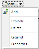
Add
Adds a new overlay theme.
The Theme Types dialog will be displayed:

Select the required Theme and click Next.
Note: The next dialog to be displayed will depend on the type of Theme selected. The parameter descriptions given here use examples of different theme types to illustrate their use.
For full descriptions of the different Themes see the section starting with What is Thematic Mapping?
Explode
Explodes the selected overlay theme. Exploding an overlay theme will create a new overlay containing the annotation graphics, e.g. Bar Charts, Pie Charts, etc. of the exploded theme. Exploding the theme will remove it from the list of overlays.
Delete
Deletes the selected theme from the list in the right-hand pane.
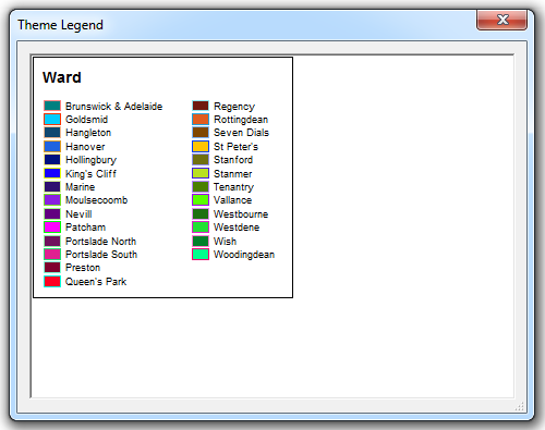
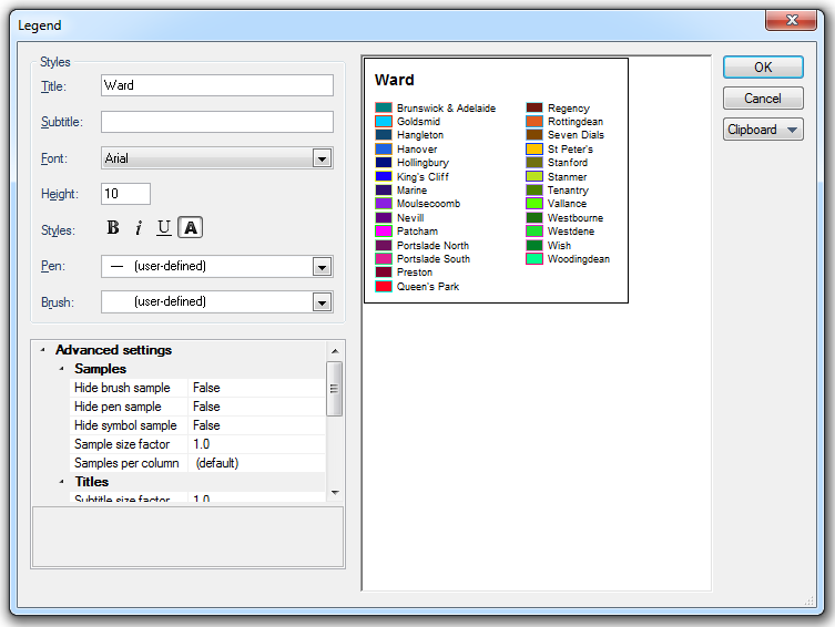
Legend
The Theme Legend screen will be displayed showing the Theme Legend.
For example:
Properties
The next dialog to be displayed will depend on the Theme chosen. In the case of the Individual Values theme the Individual Value Styles dialog will be displayed to enable you to edit the settings of the theme.
For example:
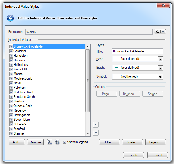
Expression
Use the drop-down at the right-hand end of the Expression box to Pick a Property or Edit an Expression:
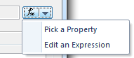
The Pick a Property or Edit an Expression dialog will be displayed.
Individual Values
This is a list of all the values that are currently being themed. When creating a new Individual Value Theme this list will be filled from the values found from all of the items in the Overlay being themed.
Styles:
Title
Each value in the Theme has a title associated with it, which will be displayed in the Theme legend. The default title is the value itself.
Pen/Brush
Selects the Pen/Brush that items with this value use for drawing. To view or edit the pen/brush, drop down the combo-box list, and press the right arrow at the bottom.
Symbol
Selects the Symbol that items with this value will use for drawing.
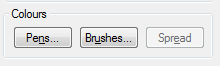
Colours:
If a Ranges theme is selected the Pens/Brushes/Spread buttons become active:
Spread becomes active if a range of values are selected.
Note: See ColorBrewer for details of ColorBrewer and Creating a Theme - Ranges showing how to use ColorBrewer in the Ranges Theme.
Filter
Displays the Expression Builder dialog to enable a filter to be set.
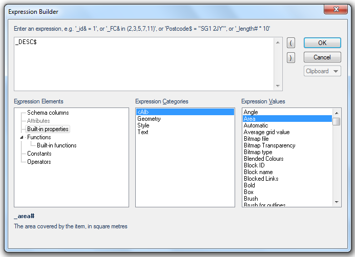
This dialog allows you to set a filter so that only attributes with specific values, or range of values, are included in the theme. This could be a range of areas, a date range or a specific date.
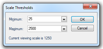
Scales
Displays the Scale Thresholds dialog to allow you to choose the minimum and maximum scale thresholds between which the theme is displayed.
Legend
Displays the Theme Legend dialog, this dialog is similar to the Theme Legend screen, shown above, but in this case the styles (Title, Subtitle, Font, etc.) may be edited.
Up/Down arrows (top-right of the Overlays dialog).
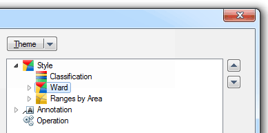
These arrows become active when the selected overlay has more than one theme and allows the theme drawing order to be set.
Check this tickbox if you want to defer drawing the labels until all Overlays have been drawn, thereby allowing cross-theme overlap and duplication tests, and improved map output.
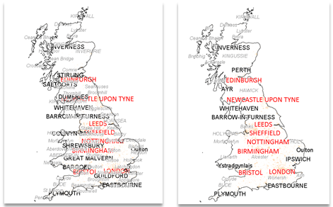
Example of the use of the "Draw labels at the end" function:
In the example shown below if you have a number of overlays all with a label theme the map can become very crowded and difficult to read.
Checking the Draw labels at the end tickbox prioritises the labels in the order the overlays appear in the overlay window, so the top overlay has priority over the next and so on. As you zoom into your project where there is less overlap you will see more labels.
These buttons are described at the end of the General tab topic.
Send comments on this topic.
Click to return to www.cadcorp.com
© Copyright 2000-2017 Computer Aided Development Corporation Limited (Cadcorp).