Labels Labels
Location: Theme Types dialog > Annotation tab > Labels
Availability: Map Modeller, Map Editor, Map Manager, Map Express
The Labels theme attaches a text label to all themed items, where the text of the label is the value of a property or an expression.
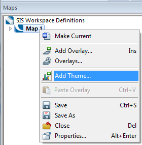
Click Add Theme [Home-Map] or highlight the SIS Workspace Definition (SWD) in the Maps Control Bar and select Add Theme...
If the SWD contains more than one overlay the following Theme Overlay dialog will be displayed:
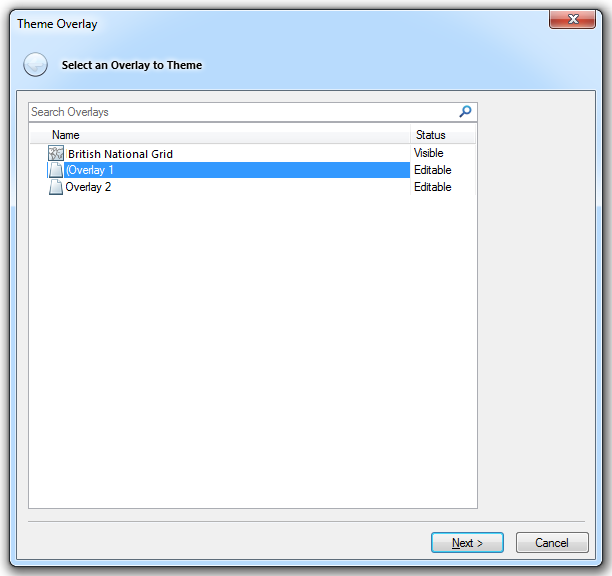
Either double-click the overlay to theme or select it and click Next.
The Theme Types dialog will now be displayed:
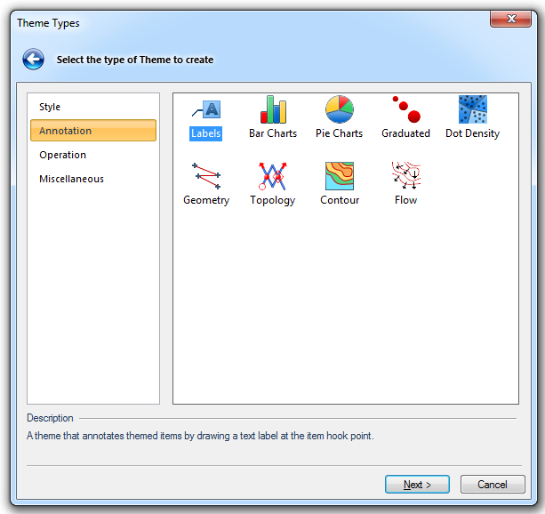
Go to the Annotation tab and either double click the Labels icon or select it and click Next.
The Property/Expression dialog will now be displayed:
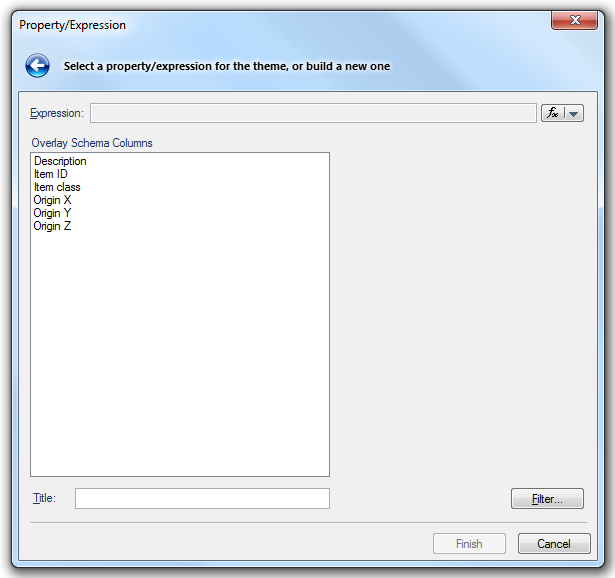
Click the fx button  to display the Pick Property or Expression Builder dialog.
Select a Property or enter an Expression and click next.
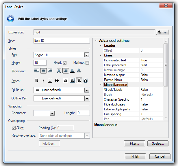
Choose the parameters for the Label's appearance and placing:
Expression
Press the fx button
Select either the Property or Expression to be used.
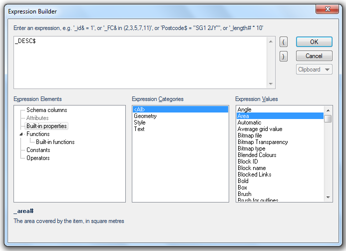
The Expression Builder dialog allows you to set a filter so that only attributes with specific values, or range of values, are included in the theme. This could be a range of areas, a date range or a specific date.
See the themes Individual Values or Ranges for a description of the use of the Expression Builder dialog.
Title
The name of the theme as shown in the Maps Control Bar.
Styles - This section defines the properties of the text.
Font
Use the drop down box to select the font that the text labels will use.
Height
Sets the point height of the labels
Fixed
Check this tickbox if the text labels are to be a fixed height on screen/paper independent of the current display scale (i.e. it always appears the same size on screen no matter how much you are zoomed in and out).
Markup
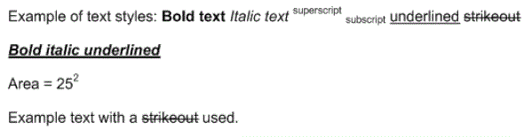
The Markup option allows a single Text Item to have: multiple states, e.g. Bold, Italic, etc., and/or multiple colours; and/or multiple fonts.
These states are:
*bold*
_italic_
^superscript^
~subscript~
+underlined+
-strikeout-
Example of text styles: *Bold text* _Italic text_ ^superscript^ ~subscript~ +underlined+ -strikeout-
+_*Bold italic underlined*_+
Area = 25^2^
Example text with a -strikeout- used.
Characters can be "escaped" (i.e. have their markup meaning ignored) by prefixing with a \, for example:
*this text is bold* but \*this text isn't (it has an asterisk before and after it instead)\*
%{css-like-directives}text-goes-here%
Alignment
Controls the alignment of the text.
The first group of three buttons are: Left, Centre, Right
The second group of four buttons are: Top, Middle, Baseline, Bottom
Styles
Controls the style of the text:
The first group of four buttons define: Bold, Italic, Underlined, Strikethrough
The second group of three buttons define: Opaque, Box, Outline
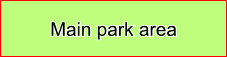
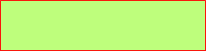
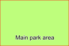
If you choose Opaque text, you can select a Brush for the background. The Brush is selected in Advanced settings >Miscellaneous in the right-hand pane:
If you choose Box text, you can select a Pen for the leader line. The Pen is selected in Advanced settings >Miscellaneous in the right-hand pane:
Fill Brush
Defines the fill colour and outline of the text. Sets the background (fill) colour for opaque text labels. To view or edit the brush drop down the combo-box list, and press the right arrow at the bottom.
Outline Pen
Defines the outline of the text (available for Outline text only). Sets the foreground (text) colour for all text labels. To view or edit the Pen drop down the combo-box list, and press the right arrow at the bottom.
Wrapping
Character
Allow labels to wrap at either a space or a tab character. You can enter your own character here, for example a comma. To remove a character from the Character box highlight it and press Delete.
Length
Labels can be automatically wrapped at the selected character, at a fixed length (in characters) as specified in the Length box, or at the first appearance of the chosen character after a minimum length (in characters).
Effect of applying Wrapping:
Overlapping
Allow
Check the Allow tickbox to allow overlapping text labels to be drawn.
Padding (%)
Available when Allow is not selected. This is a buffer used in overlap calculations, this prevents touching, or near touching, labels.
Resolve overlaps - This defines the alignment:
None (skip all overlaps) - The current alignment will not be altered.
Automatic - SIS will automatically apply an alignment algorithm.
Horizontally only - The alignment will only be applied horizontally.
Vertically only - The alignment will only be applied vertically.
Horizontally, then vertically - Horizontal alignment is applied, then vertical alignment
Vertically, then horizontally - Vertical alignment is applied, then horizontal alignment
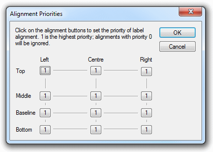
Custom - Selecting Custom will activate the Priorities button. Click the Priorities to display the Alignment Priorities dialog:
Click the buttons to change the alignment. Any locations set to 0 will not be used in the alignment process, locations set to 1 will have a higher priority than those locations set to 2. The OK button is disabled if all locations are set to 0, at least one location must have a priority of either 1 or 2.
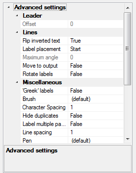
Advanced settings
Leader
Offset - Offsets label from item, and draws a connecting line. The offset is measured in text points.
Lines
Flip inverted text - Should text which is upside down be inverted? True/False.
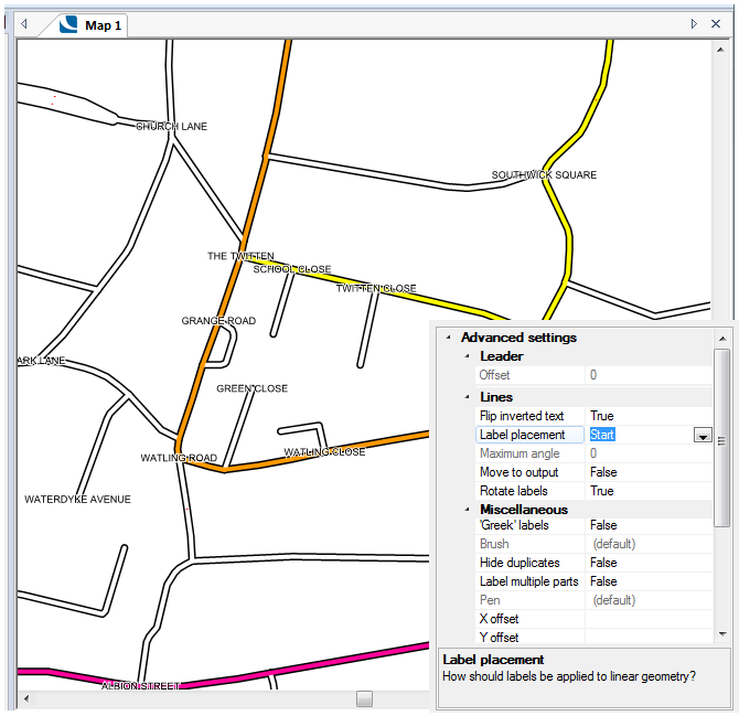
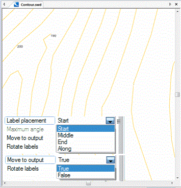
Label placement - Gives a placement option for labelling items with line geometry. Select from:
Start, Middle, End, Along
The following screen shots illustrate the effect of each of these settings:
Start
Labels placed at the Start of each LineString:

Click on image to enlarge
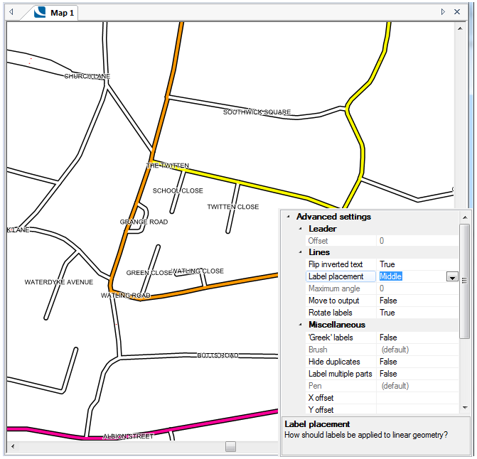
Middle
Labels placed at the Middle of each LineString:

Click on image to enlarge
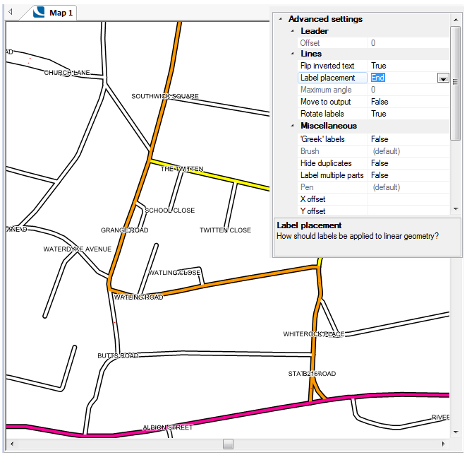
End
Labels placed at the End of each LineString:
Click on image to enlarge

A quick method of making label placement at the end for an entire overlay is to check the Draw labels at the end tickbox in the Themes tab of the Overlays dialog. See Themes - Draw labels at the end.
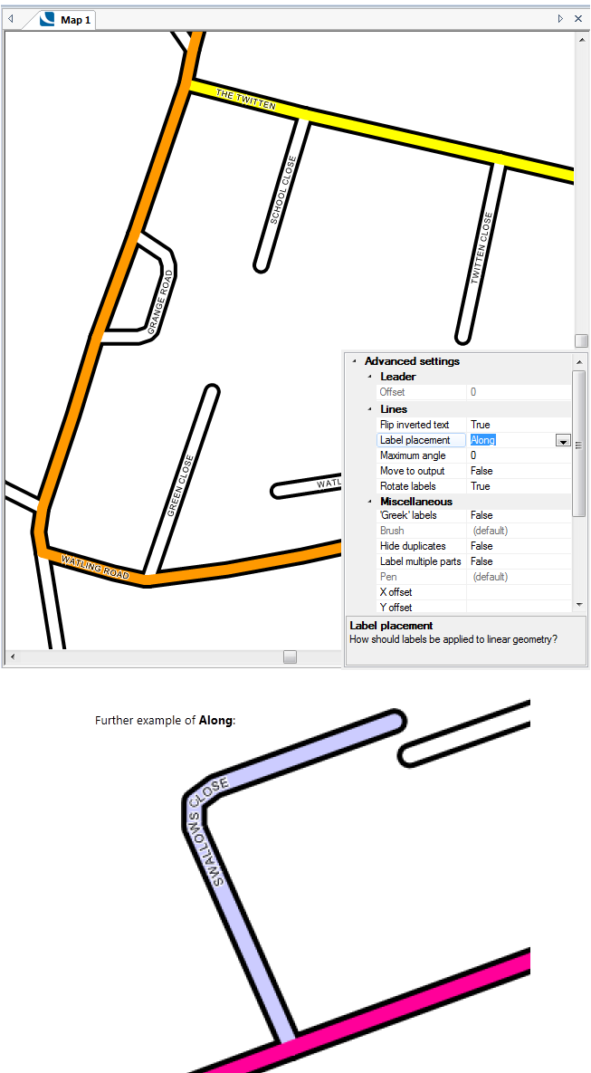
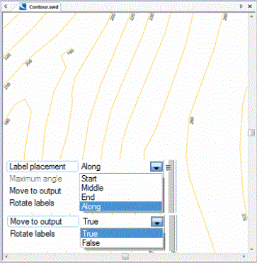
Along
Labels placed at the Along each LineString:

Click on image to enlarge
When labels are applied to lines which extend beyond the current screen view, such as contours, the Along setting will apply a Label Placement Algorithm.
Maximum angle
The maximum angle between consecutive characters when labelling along linear geometry.
Move to output - Should labels on linear geometry be placed relative to the output extents? True/False.
Set Move to output to True to force the labels to be displayed within the current view, see below:
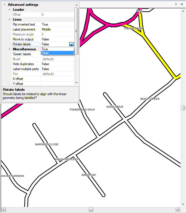
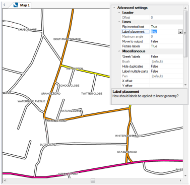
Rotate labels - Should labels be rotated to align with the linear geometry being labelled? True/False.
In the following diagrams, the RoadName$ property is placed at the Middle of each LineString item.
In this case Rotate labels is set to the default value of False:

Click on image to enlarge
In this case Rotate labels is set to True:
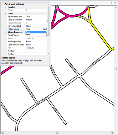
Click on image to enlarge
Rotate labels has no effect if Label placement is set to Along as the label text will always follow the LineString.
Miscellaneous
'Greek' labels - Should labels that are larger than the item being labelled be skipped? True/False.
Select True to automatically discard any labels that are larger than the item being labelled. The item size applies in both X and Y directions, for example: The following diagrams illustrate the effect of the 'Greek' labels to True/False setting:
'Greek' labels set to False:
'Greek' labels set to True but the Y direction is too small to display the label (X direction is large enough but both X and Y directions must be sufficiently large):
'Greek' labels set to True where both X and Y directions are sufficiently large to display the label:
Effect of applying Greeking:
If the label is bigger than the item it is labelling, the label does not show. Set 'Greek' labels to True to enable this control. As you zoom out the features get smaller and labels will be invisible, as you zoom in labels will become progressively visible.
Brush - The Brush used to cover any Polygon covered by the Item. This is only valid when Styles is set to Opaque, see Styles>Styles section above.
Character Spacing - Allows the adjustment of white space between characters. Decimal range 1 to 10.
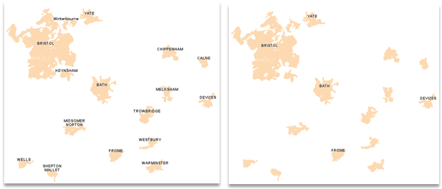
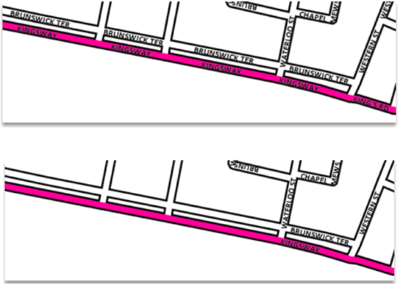
Hide duplicates - Should duplicate label strings be skipped? True/False. Set to True to skip the second and subsequent occurrences of a label string to prevent any duplicated labels being displayed.
Effect of applying Hide duplicates:
If you have Ordnance Survey ITN or Meridian 2 data and label the network you will see multiple labels for the same street name. By setting Hide duplicates to True only one label is shown, i.e. "Brunswick Ter", "Kingsway" and "Western St" are only shown once.
Label multiple parts - Should each part of multi-part item be labelled? True/False.
Line spacing - The line spacing used for multi-line text.
Pen - The Pen used to draw the Item. This is only valid when Styles is set to Box, see Styles>Styles section above.
X offset/Y offset - Offsets the labels from the item, and draws a connecting line (if specified in Leader>Offset). These offsets are measured in real world units (typically metres). Enter X and/or Y values in this box or click the ... button to display the Expression Builder dialog if the X/Y offset value(s) are to be entered as an expression.
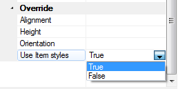
Override - In this section you can use simple properties or expressions to control the label Alignment, Height and Rotation.
Note: Alignment, Height and Orientation are only active when Use Item styles is set to True.
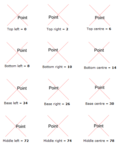
Alignment - Enter a number in this box to override the label alignment.
The numbers that may be used are:
0 = Top left
2 = Top right
6 = Top centre
8 = Bottom left
10 = Bottom right
14 = Bottom centre
24 = Base left
26 = Base right
30 = Base centre
72 = Middle left
74 = Middle right
78 = Middle centre
The following diagram shows the Alignment numbering effect using a Cross symbol as an example:
If an expression is to be used to define Alignment, press the ... button to display the Expression Builder dialog and enter an expression to override the default style.
Height - A height numeric value or an expression to override the label height.
Enter a label height value in real world units (typically metres) in this box or, if an expression is to be used, press the ... button to display the Expression Builder dialog. Enter an expression to derive the label height which will override the default style.
Orientation - Enter an orientation value in this box or, if an expression is to be used, press the ... button to display the Expression Builder dialog. Enter an expression to derive the label rotation.
A positive number will rotate the label in that number of degrees in an anti-clockwise direction. A negative number will rotate the label in that number of degrees in a clockwise direction.
Use Item styles - Set this value to True if you wish to use the Override style settings (Alignment, Height and Orientation) of the item being labelled, rather than the Label Theme styles.
Filter
The Filter... button displays the Expression Builder dialog to enable a filter be set.
For example entering _area#>1000 in the dialog will apply the label theme to only those Polygons with an area greater than 1000.
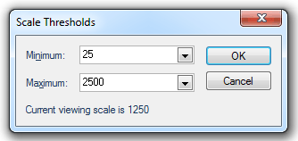
Scales
The Scales... button displays the Scale Thresholds dialog to allow you to choose the minimum and maximum scale thresholds between which the theme is displayed.
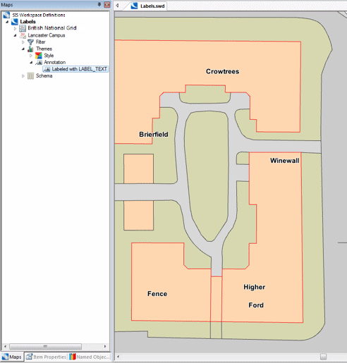
The following example shows all buildings with a Label Text property with a label showing that name.
In this example Ordnance Survey Master Map data is used. A label will be put against buildings on the map base, using the property LABEL_TEXT, or LABEL_TEXT$.
Once the Label theme has been created you can Explode it to create individual labels for each item, which can then be styled separately. The Explode command is available from the Maps Control Bar local menu:
-Local command.png)
Note: Any exploded theme will become an internal overlay.
Click here for Labels Theme properties.
Send comments on this topic.
Click to return to www.cadcorp.com
© Copyright 2000-2017 Computer Aided Development Corporation Limited (Cadcorp).

.png)
.png)